Live Data#
The ‘Getting Started’ guide has up until this point demonstrated how HoloViews objects can wrap your data and be given a rich, useful representation. All of the visualizations assumed that the data was already available in memory so that it could be used to construct the appropriate object, and all of the resulting visualizations can be viewed in static HTML pages, no longer requiring Python when users interact with them.
In many important scenarios, the assumption that the data is immediately available in memory does not hold. The data of interest may exist on some remote server, making it unavailable locally until it is fetched. In other situations, the data may exist on the local disk, but be too large to fit into memory. Perhaps the data doesn’t even exist yet: it may be the result of some computation yet to be performed or the outcome of some live process with the corresponding measurement not yet made.
All these scenarios are examples of live data that can be made available to HoloViews using the appropriate Python process. In this section, we will see how HoloViews allows you to build visualizations that can update dynamically to newly available data and that can respond to live user interaction.
A computational process#
Let us start by importing NumPy and HoloViews and loading the Bokeh extension:
import holoviews as hv
from holoviews import opts
import numpy as np
hv.extension('bokeh')


There are many possible examples of live data, including financial data feeds, real-time scientific measurements, and sophisticated numerical simulations. Here we will consider the path traced by two very simple equations:
$$x_{n+1} = \sin(ay_n) + c \cos(ax_n)$$ $$y_{n+1} = \sin(bx_n) + d \cos(by_n)$$
These equations define the ‘Clifford Attractor’ described in the book “Chaos In Wonderland” by Clifford Pickover. Now let’s write a simple Python function to iterate these two equations starting from position (x0,y0):
def clifford_equation(a,b,c,d,x0,y0):
    xn,yn = x0,y0
    coords = [(x0,y0)]
    for i in range(10000):
        x_n1 = np.sin(a*yn) + c*np.cos(a*xn)
        y_n1 = np.sin(b*xn) + d*np.cos(b*yn)
        xn,yn = x_n1,y_n1
        coords.append((xn,yn))
    return coords
If we run this function now, we’ll get a list of 10000 tuples, which won’t be very informative. To visualize this data, we can set one suitable visual defaults for the Curve and Points elements we will be using in the rest of the notebook:
opts.defaults(
    opts.Curve(color='black'),
    opts.Points(color='red', alpha=0.1, width=400, height=400))
We can now pass the output of our clifford function to the Points element, making it trivial to define a function that when called gives us a visualization:
def clifford_attractor(a,b,c,d):
    return hv.Points(clifford_equation(a,b,c,d,x0=0,y0=0))
We can then view the output for some combination of values for a,b,c,d, starting from the origin:
clifford_attractor(a =-1.5, b=1.5, c=1, d=0.75 )
This HoloViews element gives us a snapshot for the four chosen values, but what we really would like to do is to interact with the four-dimensional parameter space directly, even though that parameter space is too large to compute all possible combinations feasibly.
Live parameter exploration#
To dynamically explore these parameters, we can start by declaring a DynamicMap, passing in our function instead of the dictionary of Image elements we saw in the Introduction. We declare the four arguments of our function as kdims:
clifford = hv.DynamicMap(clifford_attractor, kdims=['a','b','c','d'])
clifford
DynamicMap cannot be displayed without explicit indexing as 'a', 'b', 'c', 'd' dimension(s) are unbounded.
Set dimensions bounds with the DynamicMap redim.range or redim.values methods.
:DynamicMap [a,b,c,d]
As you can see from the error message, HoloViews does not yet have the information needed to give us a visualization–it has no way to guess any value to use for the ‘a’,’b’,’c’, and ‘d’ dimensions. Since we know what suitable values look like, we can easily specify appropriate ranges using the redim method:
# When run live, this cell's output should match the behavior of the GIF below
clifford.redim.range(a=(-1.5,-1),b=(1.5,2),c=(1,1.2),d=(0.75,0.8), x=(-2,2), y=(-2,2))
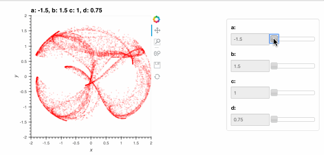
These ranges supplied with redim.range are semantic specifications of suitable values for each of the parameters and they are used to define suitable ranges for the interactive sliders above. Note how the HoloViews options system described in the Customization section continues to work with the DynamicMap.
Live interaction#
The live visualizations above are indistinguishable from standard HoloViews visualization, apart from the speed and memory usage. With a live Python server and the Bokeh backend, HoloViews can also be used to build highly customized interactive displays using DynamicMap and the streams system. A HoloViews stream is simply a parameter of a corresponding stream class configured to track some variable, typically reflecting some user interaction. For instance, let’s write a function that accepts an initial x and y value and computes a more complex version of the above plot, showing the x,y starting point as a dot along with a line segment indicating the first step taken from that point when computing the attractor, and some text showing the starting point numerically:
def interactive_clifford(a,b,c,d,x=0,y=0):
    coords = clifford_equation(a,b,c,d,x0=x,y0=y)

    points = hv.Points(coords).opts(color='green')
    start  = hv.Points(coords[0]).opts(color='black', size=10, alpha=1)
    step   = hv.Curve(coords[:2], group='Init')
    text   = hv.Text(0,1.75, 'x:{x:.2f} y:{y:.2f}'.format(x=coords[0][0],y=coords[0][1]))

    return points * start * step * text
All we have done is create an Overlay as described in the Introduction containing our Clifford attractor and a few other HoloViews elements parameterized accordingly, including Points and the Text annotation. Passing this function to DynamicMap together with a PointerXY stream that grabs the x,y locations of the mouse (in data space) creates an explorable visualization that you can interact with directly. The plot now shows the attractor (in blue) and the starting point and first step (in red), with the starting point following the mouse position (slowly, as it has to draw 10,000 points each time the pointer moves!):
from holoviews.streams import PointerXY

# When run live, this cell's output should match the behavior of the GIF below
iclifford = hv.DynamicMap(interactive_clifford, kdims=['a','b','c','d'], streams=[PointerXY(x=0,y=0)])
iclifford.redim.range(a=(-1.4,-1),b=(1.6,1.8),c=(1,1.5),d=(0.7,0.8), x=(-2,2), y=(-2,2))
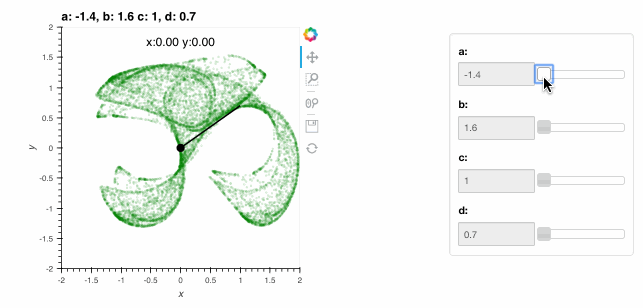
By exploring with the mouse, see if you can find the fixed-point location (where the next step maps you to the same position) located at x=0.18,y=0.65 with parameters a=-1.4, b=1.6, c=1 and d=0.7.
To learn more about the streams system please consult the user guide and check out our Streams gallery. And to explore attractors like the above in much more detail, check out the Datashader-based notebook (which uses a HoloViews DynamicMap) and the corresponding app.
Tradeoffs using live data#
DynamicMap and Streams allow specification of exciting, dynamic visualizations that let you build full-featured interactive applications and simulations with very little code (particularly when combined with a declarative widget library like Panel). The way these dynamic visualizations work is that HoloViews runs JavaScript in your browser, which then communicates with a running Python server process that may be running in the Jupyter notebook server or in the Bokeh server. This Python process may be running locally on your machine or on some remote internet or local-network server. Regardless of where it is running, this Python process executes the callback you supply to DynamicMap, allowing HoloViews to update your visualization whenever the parameters change.
This architecture is powerful and fully general, as you can always make static content in memory into dynamic output generated by a function (see the User Guide to learn more). These dynamic visualizations can then be deployed as dashboards or deployed as Bokeh Apps.
Using live data is not always recommended, however, because using purely static content also has some important advantages:
Reasons to use live data#
Your data is inherently coming from a live source and your visualization needs to reflect this in real time.
You wish to explore a large parameter space and statically sampling this space adequately is prohibitive in memory or computation time.
Your data is too big to fit in memory and you only need to explore a portion of it that you can stream in from disk.
You want an open-ended visualization that keeps updating indefinitely.
Reasons to use static data#
You wish to archive or record your visualization in such a way that it exists independently of code execution in a potentially changing codebase.
You wish to share visualizations in a static HTML file that does not require running a live server (e.g a file that can be e-mailed and immediately viewed or placed on an HTML server).
The general recommendation is to visualize your data with HoloMap (as in the introduction to this guide) when you have a small amount of data (typically a few megabytes) that can be quickly computed and can reasonably be embedded into an HTML file. Otherwise, you can use DynamicMap that you can sample from to generate a HoloMap from when you wish to share your results (see the user guide for more information on how to turn your DynamicMap objects into HoloMaps).
Now that you have explored the basic capabilities of HoloViews, you should try it out on your own data, guided by the user guide and following examples in the component reference gallery and other demos in the gallery.